The New Neutral Isn’t White
For years, white was the answer.
White cabinets. White walls. White kitchens that felt “safe” and clean and easy to sell. And for a while, it worked.
But something is shifting.
We’re watching clients walk into the showroom and instinctively reach for materials that feel softer. Warmer. Less stark. They don’t want yellow. They don’t want beige. They just don’t want everything to feel clinical anymore.
White isn’t disappearing. It’s just evolving.
Neutral Doesn’t Mean Blank
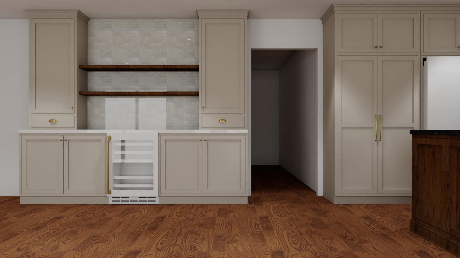
The new neutral isn’t flat. It has undertone. It has depth. It reacts to light.
Think mineral whites instead of bright whites.
Soft clay instead of gray.
Warm stone instead of cool marble.
Wood tones that feel lived in, not orange.
These tones don’t scream for attention. They settle into a space. They photograph better. They age better.
And most importantly, they feel like someone made a decision.
Light Changes Everything
Arizona light is not subtle. It washes color out. It exaggerates cool tones. It makes bright white feel brighter than you intended.
This is where material decisions matter.
A paint chip in isolation tells you nothing. Put that same paint next to cabinetry, stone, flooring, and natural light, and it becomes something else entirely.
This is why we always look at materials together, not one at a time. White can work beautifully. It just needs context.
The Move Toward Warmth
We’re seeing:
Warmer whites with soft undertones
Subtle taupes replacing gray
Limestone-inspired tile
Creamy plaster finishes
Mixed metals that feel intentional, not trendy
It’s less about contrast and more about cohesion.
High-contrast black and white kitchens are starting to feel like a moment from a few years ago. The homes that feel current right now are layered, tonal, and restrained.
Expensive Doesn’t Mean Bold
There’s a misconception that to avoid white, you have to go dramatic.
You don’t.
Often, the most elevated spaces use materials that sit close together on the color spectrum. Cream with warm wood. Soft greige with honed stone. Brushed nickel with limestone. Nothing fighting for attention.
Restraint reads expensive.
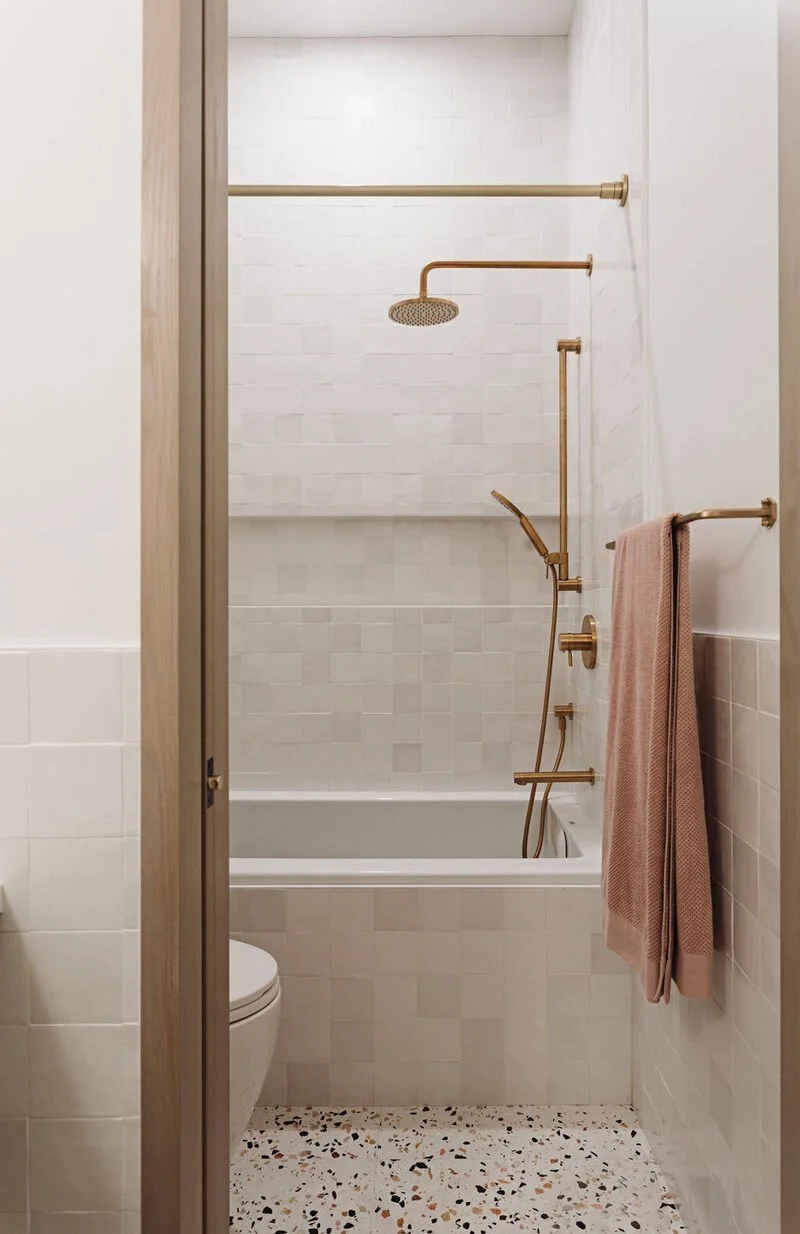
When White Still Works
White still works in the right setting.
Homes with strong architectural detail.
Spaces with darker flooring grounding them.
Projects where the client truly loves a clean, minimal look.
The difference is intention. Not default.
White shouldn’t be the automatic answer. It should be a choice.
Why We Start With Materials
Before we talk paint, we look at cabinetry. Before cabinetry, we look at the overall palette. Before that, we look at how the client actually lives.
Is this a forever home?
Are there kids? Pets? Heavy cooking?
Do they want quiet or contrast?
The new neutral conversation isn’t about color trends. It’s about building a material foundation that feels considered.
Because once cabinets go in and tile is installed, the paint decision becomes obvious.
Not the other way around.
Good design doesn’t start with a swatch.
It starts with context.